

New year, new business goals, right? Well, we just recently launched a brand new version of quintly and thought it’s time you meet. In particular, we would like to introduce you to one our most exciting new features: the Discover page.
Finding the best fitting metrics for specific purposes can be challenging on its own and there are countless possibilities to create analytics reports. When we started to develop the new version of our tool, we made it our mission so that finding and collecting the metrics best suited for our users would be as easy as possible. The Discover page is our solution and helps simplify the data analysis process. Importantly, it also provides an effective bridge to reporting with the addition of ready-made dashboards, complete with powerful metrics tailored to a wide range of use cases and marketers.
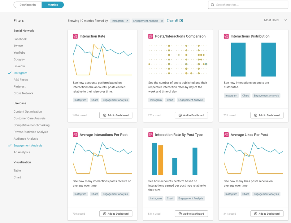
Choosing the right approach for assessing your strategy is key to success in social media marketing. The Discover page offers an "app store-like" overview with a variety of detailed dashboards and 500+ individual metrics for different goals, helping you create the most effective social media analytics process. It’s also where you will find new metrics and dashboards as soon as we add them to our library within quintly.
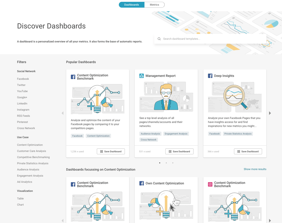
The easiest way to get started is to jump ahead and try choosing a ready-made dashboard. Begin by clicking “Dashboards” in the tab bar located up top on the Discover page. You can use the Filters panel on the left side of the page to narrow down search results and choose a specific social network, or search by specific use cases and metric visualization types.
Want to start simply with some single metrics instead? The Discover page works the same way for both. Both dashboards and metrics are displayed with a brief summary but click on any of them to see more details and explanations. The second case in this article examines metrics more closely but for now, let’s dig into some examples starting with dashboards.
How to Utilize the Discover Page? Two Examples!
To give a clearer example of how Discover works, we have chosen two cases from a marketers perspective to show how to find and add dashboards as well as metrics within quintly. First up:
Case 1: Customer Care on Facebook
“My customer service in Facebook has not been as popular as I anticipated. How can I enhance it?”
When you’re not entirely sure how to tackle the social media challenge at hand for you or your business, the quintly Discover page is a good place to go for help. In this example, we choose ‘Facebook’ from the left side Filters panel and ‘Customer Care Analysis’ as a Use Case. If you haven’t created a dashboard yet for this purpose, try it now – quintly offers a 14 day free trial.
With these dashboards, you can get deep insights on the status and progression of customer-related communications on yours or others Facebook pages or any other social network including Instagram, Twitter, YouTube and LinkedIn. Adding a dashboard to your account is easy, simply click the button that says ‘Save Dashboard’ in the bottom right of the card.
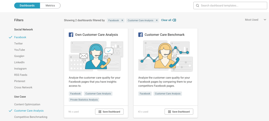
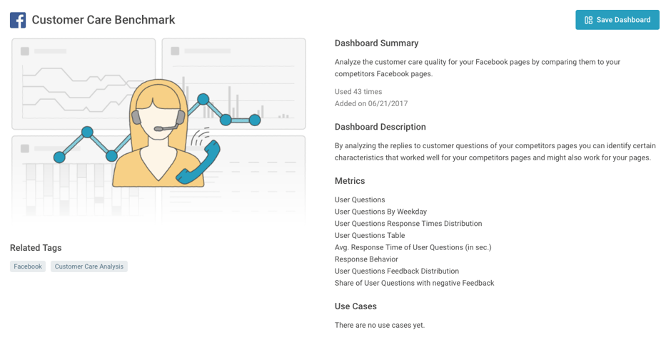
While it’s effective to use a dashboard like the ‘Own Customer Care Analysis’ to assess your own pages, in this case let’s take a look at ‘Customer Care Benchmark’ which allows you to readily compare your pages to competitors and others in the industry. Remember, you can always see a preview of the dashboard before saving it by clicking to see more background information.
When you’ve chosen the dashboard best fit for your needs, it’s time for data analysis. Add Facebook profiles and manage them into groups for benchmarking by heading to the Profiles area in quintly located on the top-most navigation bar. After completing this step and opening your saved or newly created dashboard, you are set up and ready to go! Now it’s time to compare profiles.
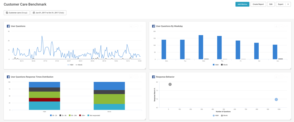
You see already from the first metrics that Monki in this case is getting less questions, but does a better job answering those questions asked by customers. However, roughly 21% of their customers still do not get any response. This presents a very clear issue to put focus on when looking to grow customer satisfaction.
The existing ready-made dashboard should be a good start for your analysis, but of course you can fully customize any dashboard in quintly. If you want to add additional metrics, simply hit the “Add Metrics” in the upper right hand corner. This will lead you again to the Discover page, where you can explore more metrics for the selected network and purpose of your analysis. Case 2 shows you how. Let’s take a look!
Case 2: Instagram Content Optimization
When you have a specific challenge such as this, like Instagram engagement for example, try searching for an individual metric to get precise insights to the problem.
This time in quintly’s new tool, we’ll choose “Metrics” from Discover page tabs. As with dashboards, you can select the desired network and use case from the left side Filters menu to discover the best fitting metrics for your needs. We’ll take a look at ‘Interaction Rate By Post Type’ for this example.
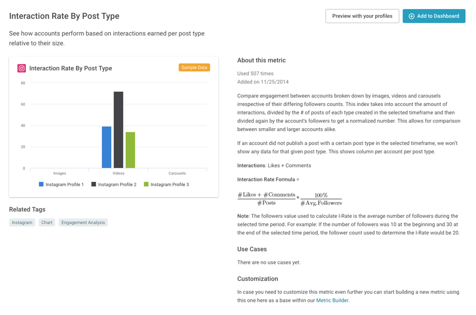
With this metric, you can see which of your Instagram posts got the most interactions from your audience. This can help you determine the best kind of content type for successfully engaging with your followers.
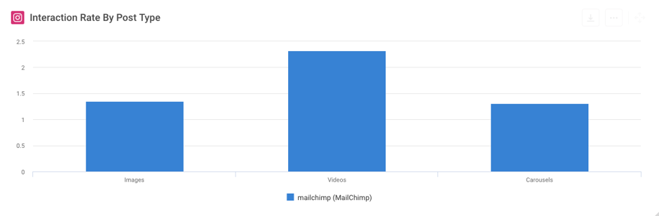
When analyzing the data, you can see that it might be different from what you could have expected. Measuring your own content is vital for uncovering those exceptions and taking the first step towards optimizing your posts on social networks. For this case, we can see that despite what a user might have read online, videos actually get the highest interaction rate, not images as might have been believed.
Find the Best Fitting Metrics and Purposeful Dashboards Easily
Without question, the new quintly saves you time in social media analysis. Our new Discover page offers inspiration for reporting and analysis, making advanced analytics easier to approach than ever. Get ahead with ready-made dashboard templates or focus on exact metrics for any specific goal you have in mind. With a range of features tailored to help users find solutions faster to their social media challenges, it helps you explore and select the right KPIs for assessing your specific strategic goals in social media marketing.
If you haven’t tried it yet, there’s no better time than now. The new quintly is now widely available for all users.

Join the conversation. Leave us a comment below!