
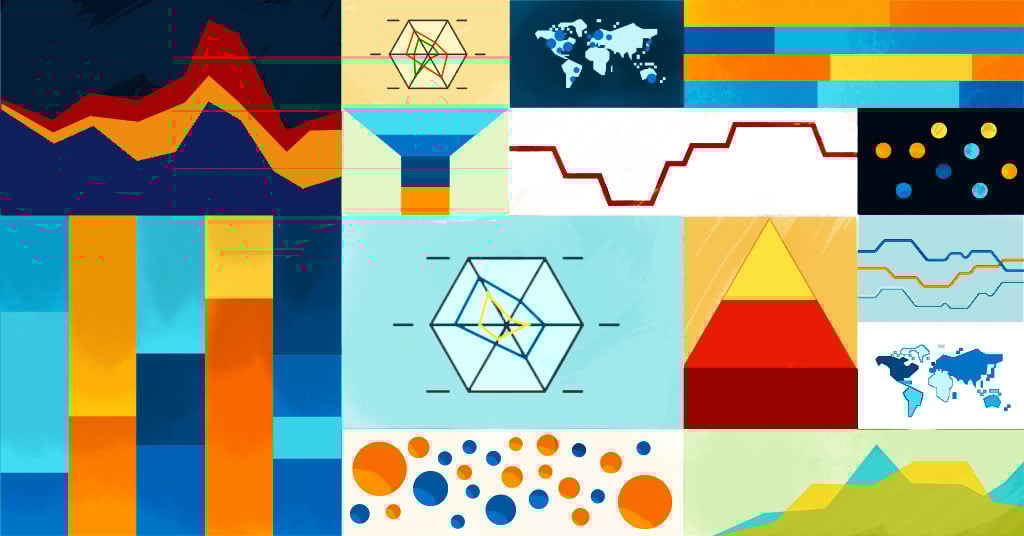
Graphs are a big part of analytics. Line charts, column charts and the occasional pie chart are possibly the most popular charts we see out there, but it doesn’t mean we are limited to using them every time. And even if we do enjoy these charts, we can always swap between them to see what makes a metric shine the most. It is about reaching more insights in the end, and reaching them faster too.
If you are used to analytics platforms that offer static possibilities, you might be wondering why I am talking about chart types. But if you have come across quintly analytics and other business intelligence tools that offer customisation, you know what I mean. With quintly you can basically choose any chart type you like for a metric. You can go for the simple charts, but you can also explore bubble charts, waterfalls, stacked percentages, and so forth. The objective is, again, that we reach more insights and faster.
In my recent book on social media analytics strategy, with Apress, I explore certain aspects that help us decide on the best chart for the job. The book is a great resource for many aspects of social analytics, but with the focus on charts we can pull from it the following:
A good metric graph must have four essential qualities:
1. Uncluttered information
2. Quick reading
3. Easy interaction
4. Easy interpretation
Naturally, these four topics are up for debate. It comes to a personal decision and opinion the view of what is cluttered and what is uncluttered, how quick is a quick reading, and how easy it is to interact and interpret the data. The key, therefore, is not to set a rule, but a guideline for our own decision making when using analytics.
Jumping right into it then, there are a few things we can have in mind when approaching chart type possibilities:
1. Explore chart types
2. Build a collection of favourites without specific purpose
3. Add potential purpose to favourite charts
4. Validate your output with other professionals
Exploring Chart Types
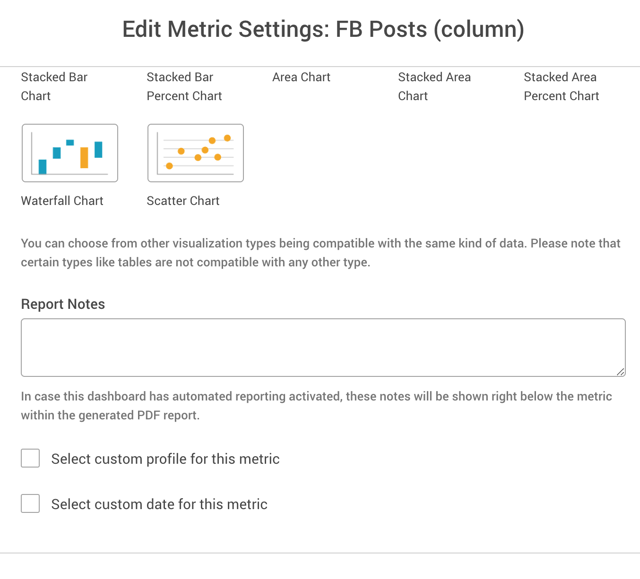
Quintly offers the possibility to choose any chart type for the job. Many of the charts are available for swap directly from the front-end of the platform. This makes it quite easy to explore possibilities with chart types.
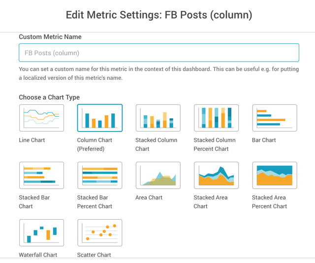
If the chart you have in mind does not happen to show up for the specific metric you are working with, you can always contact the quintly team and ask for a custom chart tailored just for you. What matters is that you can have the chart you prefer for your metric display.
Build a Collection of Favorites without Specific Purpose
Many times we are browsing around the platform and bump into charts that we really enjoy. One way of keeping track of these is to add them to a dashboard. This dashboard will serve as a collection of interesting charts and metrics for us to browse through when new projects come up. Dashboards are unlimited in quintly, so we can take advantage of that and use dashboards for much more than just reporting.

Add Potential Purpose to Favourite Charts
If you are like me, and enjoy always having one or more purpose attached to everything you work with, you can add these to each metric’s notes. The same chart type can be interesting for different kinds of metrics, but maybe we don’t need to use them immediately, so we take notes on their potential purpose for future reference. This can speed up the review of our collection when a project comes up and a deadline is waiting for us.
Validate Your Output with Other Professionals
Sharing our insights is a great way to move ahead with our strategy and use of analytics. All the feedback that we can get on charts and especially innovations in metrics is always very interesting. Colleagues in our field can help us fine-tune what we are doing, and also validate the relevance of our new creations. In some cases, even colleagues in different industries, that are not marketers but work on finance, logistics or retail and e-commerce pricing can give us some interesting insights on chart types and concepts for KPIs. Social networking on Linkedin is great for this kind of activity, and can even generate engagement for our personal brand.
In Conclusion
While the conversation around the best chart for a certain job can go further than our explorations in this post, what is key to keep in mind is that we really must look for the best chart when we work with analytics. The results can be greatly enhanced by what may seem as a simple change to a metric display. While we can eventually share the charts that we like best for each metric, as an analyst, it really comes down to your opinion of what you like to work with, and we are sure you can then tell us why and even convince us that a certain chart type could be the default for the platform. So let us know your thoughts and if you are a client in quintly, just get in touch with the team for chart changes and custom metrics you would like to have. Happy analysing!

Join the conversation. Leave us a comment below!